| Author |
Message |
    
Alleygater
Citizen
Username: Alleygater
Post Number: 1910
Registered: 10-2004
| | Posted on Monday, May 8, 2006 - 9:25 pm: | 


|
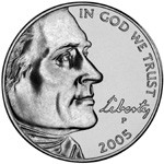
OK, didn't know where to post this, so Virtual Cafe will have to do. Now, I know I am a bit late to this topic since the nickel I am holding on to right now say 2005. What is the deal with the darn thing?
First off it's a monstrosity. Was there something wrong with Jefferson that they needed to alter his appearance? They moved him right off the nickel. 3/4 of him is somewhere else, certainly not on my coin that's for sure. Then there is that horrible cursive Liberty text. Did they use the font Mistral? It's fugly. Then the text wraps around the outside of the coin, which is hard to read and well...just dumb. This coin feels to me like it was designed by a art school drop out.
Secondly, the back side of the coin has got a bison on it. I'm a animal lover, I'm ok with it so far. That is until I see a misprint on the coin. I'm thinking to myself, "woohoo!!! these poorly machined coins are worth money". So I take a closer look. And lo and behold there isn't anything wrong with the printing. Instead I'm staring at a bison's penis. Yes you got it. For some reason it was decided that our country needed just a little more cock. No we couldn't use a female bison as the model.
Who in the world approved this thing?!? |
Jgberkeley
Citizen
Username: Jgberkeley
Post Number: 4562
Registered: 5-2001
| | Posted on Monday, May 8, 2006 - 9:40 pm: |
|
Thank you for venting!!!
As a business owner, I can not tell you how many of these darn coins end up in the quarter bin of the cash register.
I do not know why, they are the size of a nickel, but they do, ever day, every week.
Something is wrong!!!!!!!!!!!
Later,
Jgberkeley |
LilLB
Citizen
Username: Lillb
Post Number: 1660
Registered: 10-2002

| | Posted on Monday, May 8, 2006 - 10:28 pm: |
|
I HATE the new nickels. They look like a mistake happened at the mint. |
TomD
Citizen
Username: Tomd
Post Number: 433
Registered: 5-2005

| | Posted on Monday, May 8, 2006 - 10:41 pm: |
|
I like the new nickels.
 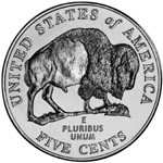 
Bison (at least the male ones) have penises. So I don't get what's wrong with including it.
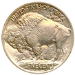
The bison is reminiscent of the old buffalo head nickel
and I like the Lewis and Clark thing. |
sbenois
Supporter
Username: Sbenois
Post Number: 15007
Registered: 10-2001

| | Posted on Monday, May 8, 2006 - 11:23 pm: |
|
Nothing beats the 1937D 3-legged Buffalo.
|
crossroads
Citizen
Username: Crossroads
Post Number: 144
Registered: 12-2001

| | Posted on Tuesday, May 9, 2006 - 8:16 am: |
|
I like the new nickel very much.
Script font "Jefferson" is based on real handwriting of Thomas Jefferson.
There is a draft of the original text of the Declaration of Independence written by Jefferson available.
It was used as a primary source for the font.
If you�re dumb enough to think it's a quarter - oh well.
|
Tom Reingold
Supporter
Username: Noglider
Post Number: 14150
Registered: 1-2003

| | Posted on Tuesday, May 9, 2006 - 8:39 am: |
|
I think the new nickel is beautiful, and I like the return of the bison to it.
I'm collecting one of each of the 50 states-of-the-union quarters. It's fun, and I like the designs.
|
TomD
Citizen
Username: Tomd
Post Number: 435
Registered: 5-2005
| | Posted on Tuesday, May 9, 2006 - 9:46 am: |
|
3-legged buffalo? I would hope that unless it learned to walk on its hind legs it's a "5-legged" buffalo!  (I'm kidding, I know that you're correct in the common name, but I found it funny). (I'm kidding, I know that you're correct in the common name, but I found it funny).
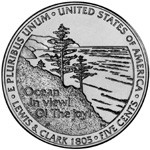
I read Stephen Ambrose's book about Lewis and Clark a few years back (Undaunted Courage I think it was called) and really enjoyed it. The 200th anniversary of the expedition makes it fitting to commerate it on a coin and, with Jefferson's long association with the nickel, it is the perfect place.
I even like the exhalative moment they chose for Lewis and Clark, "Ocean in view! O! The joy!" Not a picture of some guys in a canoe, not a map of the pacific northwest, but the moment when they reached the opposite end of the continent. Not bad for five cents.
Am I the only one who does this?
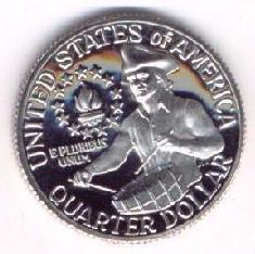
When I take the time to look to the coins in my pocket (which isn't very often), I always take note of the ones that are older than I am and how much they've bounced around in thirty or forty years. Nowadays, I take special note of the old pennys that just said "ONE CENT" on the back, but I rarely see them anymore. Those and the bicentennial quarters, which the little boy in my still thinks are kinda cool.
 |
Buzzsaw
Citizen
Username: Buzzsaw
Post Number: 4677
Registered: 5-2001

| | Posted on Tuesday, May 9, 2006 - 10:23 am: |
|
I like the new nickel. Variety is the spice of life.
If you want to see good artwork from American currency - check out the educational notes.
|
John Caffrey
Citizen
Username: Jerseyjack
Post Number: 221
Registered: 11-2005
| | Posted on Tuesday, May 9, 2006 - 11:48 am: |
|
I like the new nickels. Others don't.
It's like the post office used to say,
"Each to his zone." |
mjc
Citizen
Username: Mjc
Post Number: 1119
Registered: 10-2004
| | Posted on Tuesday, May 9, 2006 - 1:06 pm: |
|
Without wishing to disappoint anyone, I think the appendage on the buffalo probably represents a tuft of hair. It's a little far forward for other functions.
That said, I know I'm a fogy, because most of the new currency and coins look like something from an operetta country to me (or, name of country from Arms and the Man? The Mouse That Roared?).
Except for some of the state quarters, esp. the Connecticut one with the tree, which I like a lot. |
Tom Reingold
Supporter
Username: Noglider
Post Number: 14163
Registered: 1-2003
| | Posted on Tuesday, May 9, 2006 - 1:16 pm: |
|
Sorry, mjc, but it is that far forward on those animals. Same on domestic bulls.
|
mjc
Citizen
Username: Mjc
Post Number: 1122
Registered: 10-2004
| | Posted on Tuesday, May 9, 2006 - 4:46 pm: |
|
oops |
Alleygater
Citizen
Username: Alleygater
Post Number: 1912
Registered: 10-2004
| | Posted on Wednesday, May 10, 2006 - 9:01 am: |
|
Well just answer me this: Why couldn't they have used a female bison as a model? I assume it would have looked the same as the male one just without the extra protusion. |
Andrea Weisbard
Citizen
Username: Njnetsfan
Post Number: 445
Registered: 6-2004
| | Posted on Wednesday, May 10, 2006 - 9:14 am: |
|
Alleygater,
The nickles were designed my a man...if it were designed by a woman, then that would be a different story(LOL)! |
Rastro
Citizen
Username: Rastro
Post Number: 3051
Registered: 5-2004

| | Posted on Wednesday, May 10, 2006 - 12:11 pm: |
|
if it were designed by a woman, it would have a cuddly kitten or puppy on it.
Yes, I was kidding. Please don't hunt me down and kill me. |
Hoops
Citizen
Username: Hoops
Post Number: 1313
Registered: 10-2004

| | Posted on Wednesday, May 10, 2006 - 3:08 pm: |
|
The new nickles feel lighter and are strange looking but we'll all get used to them. I think Alleygators rant is hilarious though.
|