| Author |
Message |
    
mjc
Citizen
Username: Mjc
Post Number: 97
Registered: 10-2004
| | Posted on Thursday, December 16, 2004 - 9:31 am: |     |
Dave -
OK, so I see this morning that if I lean over and squint there's a difference in the brightness of items that have been read and those that haven't. Hope you're still tweaking this aspect?
thanks -
MC |
    
sac
Citizen
Username: Sac
Post Number: 1709
Registered: 5-2001
| | Posted on Thursday, December 16, 2004 - 1:47 pm: |     |
I see that things have changed again, but I still can't tell the difference between read and unread items. |
    
Dave
Moderator
Username: Dave
Post Number: 4712
Registered: 4-1998

| | Posted on Thursday, December 16, 2004 - 2:17 pm: |     |
What depth of color is your computer set to? For reference, these are the link colors.
 |
    
Joan
Citizen
Username: Joancrystal
Post Number: 4475
Registered: 5-2001
| | Posted on Thursday, December 16, 2004 - 4:35 pm: |     |
Dave:
The color in the box on the left looks the same as the color used for your name in your above thread but the color on the right is deeper than the color in which viewed links appear. For those of us who are somewhat older and losing our ability to distinguish shades of colors the difference between the color of the box on the left and the color of the box on the right is not great enough for us to distinguish them without straining. Also, the color on the right appears to my eyes to be too light to read the lighter colored links clearly.
I think the problem Wendy is alluding to is that the combination of the new font you are using for posted text and the line spacing between the lines of said text makes it extremely difficult to read posts without straining the eyes.
The font and line spacing used in the dialog box in which posted text is entered is much easier to read.
Hope this helps. |
    
Dave
Moderator
Username: Dave
Post Number: 4716
Registered: 4-1998

| | Posted on Thursday, December 16, 2004 - 4:51 pm: |     |
It does. I want to keep the unviewed/viewed links in the same tone but in varying intesnsities. My feeling is if I make the viewed link any lighter it may be even harder to read and people have also expressed discomfort for brighter reds.
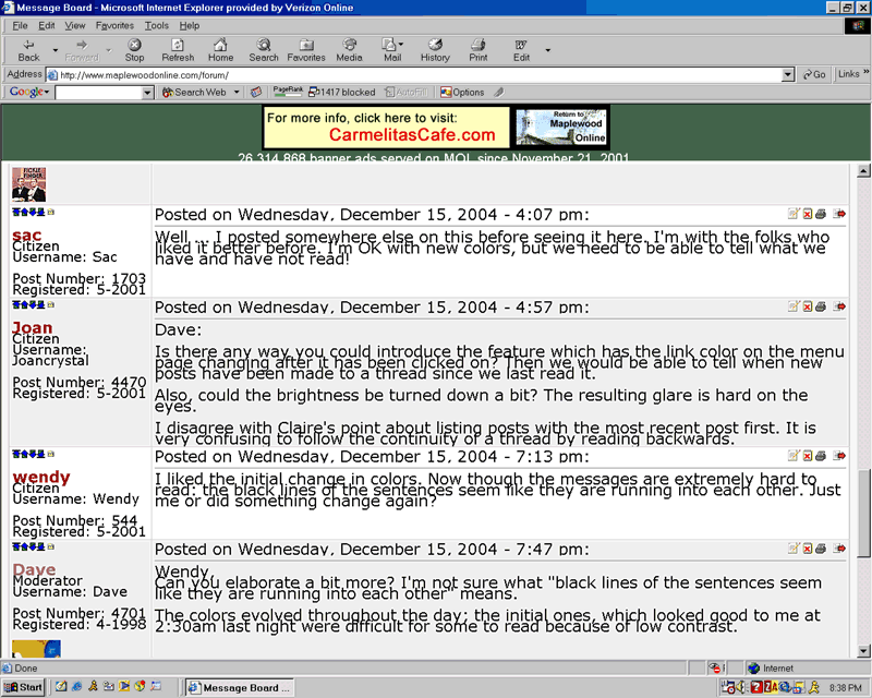
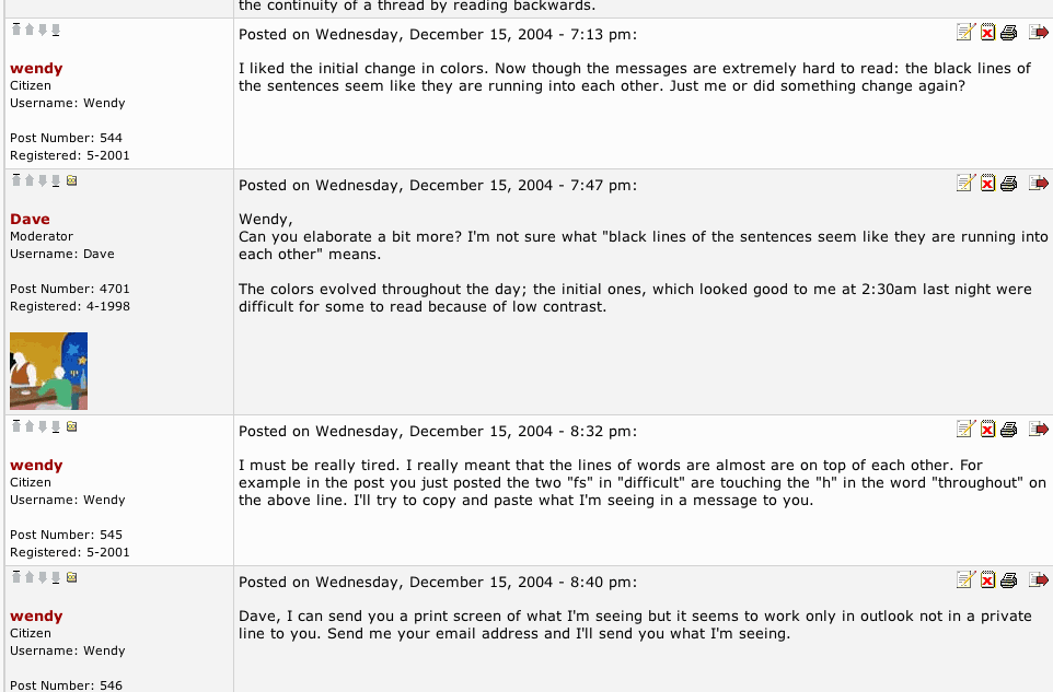
More concerning at the moment is the typeface situation. This is what Wendy is seeing:

And this is what I"m seeing:

------------------------------------
I saw a potential font conflict and think I fixed it. Wendy will let us know, I guess. |
    
Joan
Citizen
Username: Joancrystal
Post Number: 4478
Registered: 5-2001
| | Posted on Thursday, December 16, 2004 - 5:03 pm: |     |
Dave:
The line spacing problem is even worse when someone uses the large or very large font size option in a post. At that scale, the lines actually overlap each other. |
    
Joan
Citizen
Username: Joancrystal
Post Number: 4479
Registered: 5-2001
| | Posted on Thursday, December 16, 2004 - 5:06 pm: |     |
Testing to see if problem still exists:
Testing to see if problem still exists or if your most recent adjustment has fixed it satisfactorily.
Note on color contrast: Part of the problem I am seeing with lighter color links is the lack of contrast with the grey background. Perhaps if you adjusted the background color this would help.
Edited to add: large text appears a total jumble. |
    
Dave
Moderator
Username: Dave
Post Number: 4719
Registered: 4-1998

| | Posted on Thursday, December 16, 2004 - 5:10 pm: |     |
Anyone having this problem, it would be helpful to know what browsers are being used. On Windows, go to "help" then "about" and post here something like this:
Windows XP Pro / FireFox version 1.0
or
Windows 98 / Internet Explorer 5.5
etc |
    
Dave
Moderator
Username: Dave
Post Number: 4720
Registered: 4-1998

| | Posted on Thursday, December 16, 2004 - 5:12 pm: |     |
Joan: Yes, I see those overlaps now. Not quite a jumble, but definitely noticeable. |
    
mjc
Citizen
Username: Mjc
Post Number: 98
Registered: 10-2004
| | Posted on Thursday, December 16, 2004 - 5:15 pm: |     |
Dave, bless you, I second Joan, that there is not enough contrast between the "read" and "not read" intensities. I really have to peer.
No problem with font. It seems to be the same as before the changes? Does not look at all like the samples from Wendy or you above.
Enjoy!
MC |
    
Dave
Moderator
Username: Dave
Post Number: 4721
Registered: 4-1998

| | Posted on Thursday, December 16, 2004 - 5:27 pm: |     |
Which link color seems to work best of these? (The current color for visited links is set on #1)
 |
    
Joan
Citizen
Username: Joancrystal
Post Number: 4482
Registered: 5-2001
| | Posted on Thursday, December 16, 2004 - 5:33 pm: |     |
Number 1 would work best if the background were white. Numbers 2 and 3 are nearly invisible when a white background, such as the one in your example, is used. All three colors are much to close to the value of grey being used on some of the menu pages to be clearly seen against that color background.
Edited to add: I am using windows XP Service Pack 2/AOL 9.0 |
    
kmk
Supporter
Username: Kmk
Post Number: 344
Registered: 5-2001
| | Posted on Thursday, December 16, 2004 - 6:33 pm: |     |
Windows XP (sp2)/Internet Explorer 6.0
I have the smooshed together lines and the overlapping large fonts also. |
    
kmk
Supporter
Username: Kmk
Post Number: 345
Registered: 5-2001
| | Posted on Thursday, December 16, 2004 - 6:35 pm: |     |
BTW I noticed the change-over to the smooshed together version right after I posted the recipe for Mu Wan yesterday.....might give you an idea of timelines. |
    
Dave
Moderator
Username: Dave
Post Number: 4725
Registered: 4-1998

| | Posted on Thursday, December 16, 2004 - 6:53 pm: |     |
That helps. How does the type look now on this page? |
    
kmk
Supporter
Username: Kmk
Post Number: 346
Registered: 5-2001
| | Posted on Thursday, December 16, 2004 - 9:26 pm: |     |
Just finished the dishes, came back to check in....the type looks great! I will nose around a little and see if I notice any other quirks. |
    
kmk
Supporter
Username: Kmk
Post Number: 347
Registered: 5-2001
| | Posted on Thursday, December 16, 2004 - 9:33 pm: |     |
This page looks great....other pages are still smooshed (recipes, home fix-it) in some areas, mainly posts from 2 or more days ago.
The oversize text above is perfectly clear now, however. |
    
Dave
Moderator
Username: Dave
Post Number: 4728
Registered: 4-1998

| | Posted on Thursday, December 16, 2004 - 9:39 pm: |     |
The rest of the site will update overnight. |
    
sac
Citizen
Username: Sac
Post Number: 1711
Registered: 5-2001
| | Posted on Thursday, December 16, 2004 - 9:44 pm: |     |
I am using IE 6.0 on Windows Me and IE 6.0 and I also checked my kids' computer which has IE 6.0 and Win 98. Both look the same.
What I'm seeing is very different from any of the screen print examples shown above. The print on mine is much less bold than on those screenprints and (as mentioned before), there is little or no indication of what has been previously read.
PS - How do you post a screen print? |
    
Dave
Moderator
Username: Dave
Post Number: 4729
Registered: 4-1998

| | Posted on Thursday, December 16, 2004 - 9:51 pm: |     |
Can you see the color variances in my 5:27 post numbered 1,2 and 3?
(I think there's a print screen key on a PC, which copies the screen into a buffer; then you open an image editor and copy it into a new file. I may be wrong though.) |
    
Dave
Moderator
Username: Dave
Post Number: 4730
Registered: 4-1998

| | Posted on Thursday, December 16, 2004 - 10:07 pm: |     |
kmk-
Check the recipe section now |
    
sac
Citizen
Username: Sac
Post Number: 1713
Registered: 5-2001
| | Posted on Thursday, December 16, 2004 - 10:08 pm: |     |
Yes, I see the color (and intensity) variance there.
The screen print button puts the image in the clipboard. In programs like Word, I just do a paste and the image is inserted and can then be saved in the document. I can't paste the image here, though, so there's still a missing link for me somewhere in this. |
    
Dave
Moderator
Username: Dave
Post Number: 4731
Registered: 4-1998

| | Posted on Thursday, December 16, 2004 - 10:12 pm: |     |
You can email it to me at
dave@davidrossdesign.com |
    
susan1014
Citizen
Username: Susan1014
Post Number: 267
Registered: 3-2002
| | Posted on Thursday, December 16, 2004 - 11:06 pm: |     |
Dave,
I often read on a laptop, and link color 1 above looks just like the unread link color over about half of the range of angles that work well for looking at my screen. Every time I come to MOL right now, I have to adjust my screen angle until I find the angle that makes the colors work. Not a big issue, but an annoyance
Thanks for putting up with all the comments! |
    
wendy
Supporter
Username: Wendy
Post Number: 548
Registered: 5-2001
| | Posted on Thursday, December 16, 2004 - 11:19 pm: |     |
Just got home (from a holiday party). Things look great from this end as far as lines not on top of each other anymore. Thanks. |
    
kmk
Supporter
Username: Kmk
Post Number: 348
Registered: 5-2001
| | Posted on Friday, December 17, 2004 - 7:30 am: |     |
Dave,
Good Morning. The recipe section is a thing of beauty. You really know what you are doing.
K |
    
sac
Supporter
Username: Sac
Post Number: 1714
Registered: 5-2001
| | Posted on Friday, December 17, 2004 - 9:27 am: |     |
It seems that the print screen captures a more intense (and less problematic) version that what I am usually seeing, so I can't even convey it to you that way.
In fact, I have noticed (and this seems to be what the screen print captures) that while I am sliding the scroll bar, the colors intensify and the contrast increases. But when I stop scrolling, it goes back to the view where everything is relatively nonbold and it is difficult to detect the differences between read/unread/etc. Unfortunately, I haven't mastered reading text as it scrolls up or down, so this doesn't offer a good workaround to the problem.
By the way, all of this is in the results displays from searches and (to a lesser degree) in the topics listing. The changes in intensity seem to be a characteristic of the red text only, as best I can determine. The actual discussion thread windows are OK, perhaps because the only red text there seems to be the usernames of the posters.
|
    
mjc
Citizen
Username: Mjc
Post Number: 103
Registered: 10-2004
| | Posted on Friday, December 17, 2004 - 4:30 pm: |     |
Hi Dave, I'm still having trouble with read vs. unread. All 3 options in your post of 12/16 at 5:27 are fine given the typeface(s) and background color of that post, but I really have to pause and concentrate to distinguish the 2 intensities on the Topics page. The thread titles are strictly a crap shoot for me, barely any difference at all.
Sorry to keep complaining when MOL is 99.44% perfect and a joy, but still hoping for a change.
Happy weekend!
MC |
    
Joan
Citizen
Username: Joancrystal
Post Number: 4484
Registered: 5-2001
| | Posted on Friday, December 17, 2004 - 4:49 pm: |     |
Dave:
Line spacing looks great. Text is much clearer. Thanks for the adjustment. |
    
mjc
Citizen
Username: Mjc
Post Number: 105
Registered: 10-2004
| | Posted on Friday, December 17, 2004 - 6:15 pm: |     |
Yahoo!!! Great improvement on the thread titles.
 |
    
sullymw
Citizen
Username: Sullymw
Post Number: 432
Registered: 5-2001
| | Posted on Monday, December 20, 2004 - 9:20 am: |     |
Can you underline the thread titles to set them off from the messages just a bit more? Even though they are a larger font, my mind still mushes them together |
    
sac
Supporter
Username: Sac
Post Number: 1719
Registered: 5-2001
| | Posted on Monday, December 20, 2004 - 1:24 pm: |     |
The contrast now seems to be improved. I can tell which items are read vs unread.
Thanks!
(I'm not sure that I "like" it better than the old, but functionally we seem to be back to where we were.) |
    
Joan
Citizen
Username: Joancrystal
Post Number: 4556
Registered: 5-2001
| | Posted on Thursday, December 23, 2004 - 4:53 pm: |     |
Dave:
The dark green bands of color which appeared today are draining the color from the titles of the read posts immediately below them (XP Professional/IE 6.0). A less intense green (spring green perhaps) would be easier on the eyes. |